
ROGERS • Product Design
Rogers is one of Canada’s largest telecommunications providers.
I redesigned Rogers’ mobile plan selection experience to resolve pricing ambiguity and reduce abandonment. Introduced a persistent cart model that centralized promotional logic and improved pricing transparency.
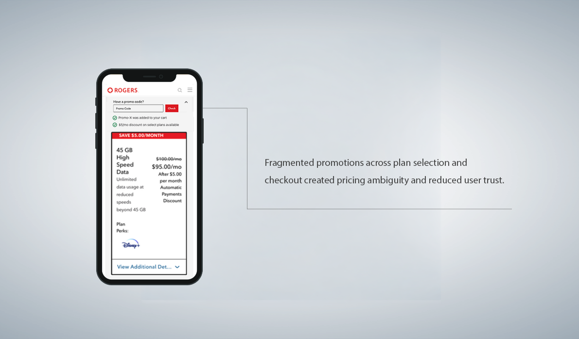
Fragmented Promotional Logic on the BUY FLOW
CONTEXT
Rogers is one of Canada’s largest telecommunications providers, offering mobile, internet, and bundled service plans. The buy flow supports complex pricing tiers and layered promotional rules.
PROBLEM
Fragmented promotions across plan selection and checkout created pricing ambiguity and reduced user trust.
• Analytics showed that 25% of users perceived plans as more expensive due to unclear promotional pricing, with the highest abandonment on mobile.
ROLE
Senior Product Designer, Buy Flow team:
• Led UX strategy and interface design to restore pricing transparency and reduce mobile friction.
CHALLENGE
Clarify promotional value and streamline the path to checkout without overhauling the existing architecture.
scroll down to read more…
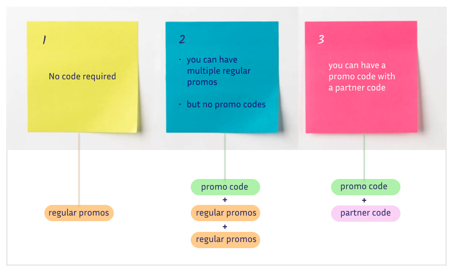
METHODOLOGIES - MAPPING PROMOTIONAL RULE COMPLEXITY
Before restructuring the design, I analyzed how promotional rules were applied. Promotions originated from multiple sources:
• Regular plan-based promotions
• Stacked recurring offers
• Partner-specific promo codes
• Eligibility-driven discounts
• Partner-specific promo codes
• Eligibility-driven discounts
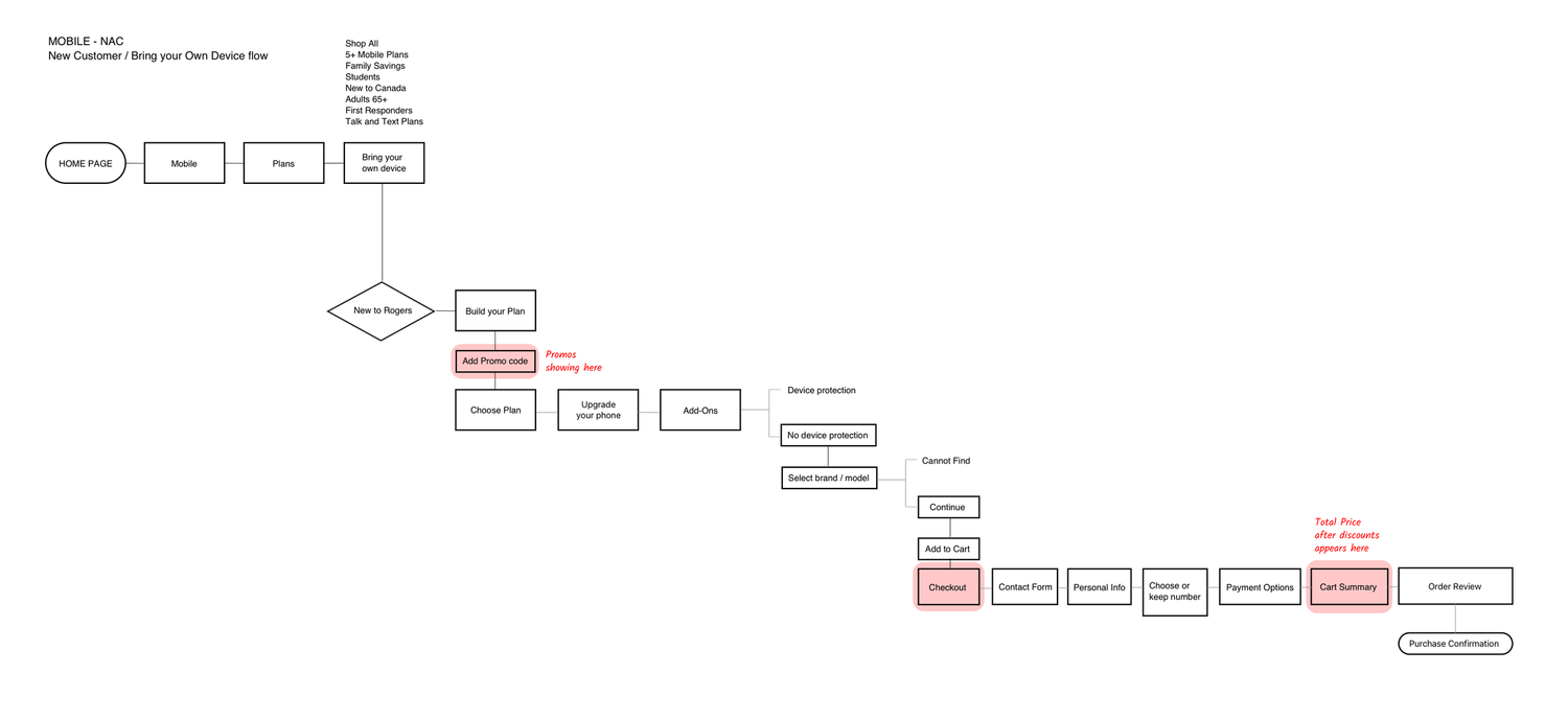
JOURNEY ANALYSIS & PAIN POINTS
Journey analysis revealed that pricing ambiguity compounded across the flow.
• No consistent reinforcement of final monthly cost before checkout
• Excessive scrolling before checkout on mobile view where more than 70% of users start their Journey
• Promotional logic distributed across screens
Mobile breakpoint limitations amplified these issues, increasing cognitive load at the moment of financial commitment.
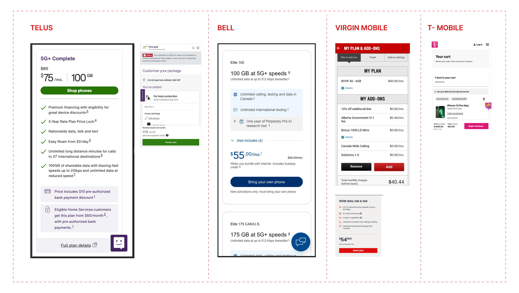
METHODOLOGIES - COMPETITIVE ANALYSIS + INDUSTRY BEST PRACTICES
After identifying where all the promotions came from and evaluated the full Buy Flow journey:
• I Benchmarked industry leaders to identify best practices for promo clarity and checkout accessibility.
• Researched Industry leaders such as Baymard Institute.
• Conducted heuristic evaluation of the flow.
CONCLUSION OF ANALYSIS
TELUS, Bell, Virgin Mobile, and T-Mobile revealed consistent base price anchoring across competitors.
However, higher-clarity experiences reinforced pricing context through either:
• Persistent cart summaries
• monthly totals
• Clear separation between base pricing and promotional adjustments
FINAL DESIGNS
OUTCOME
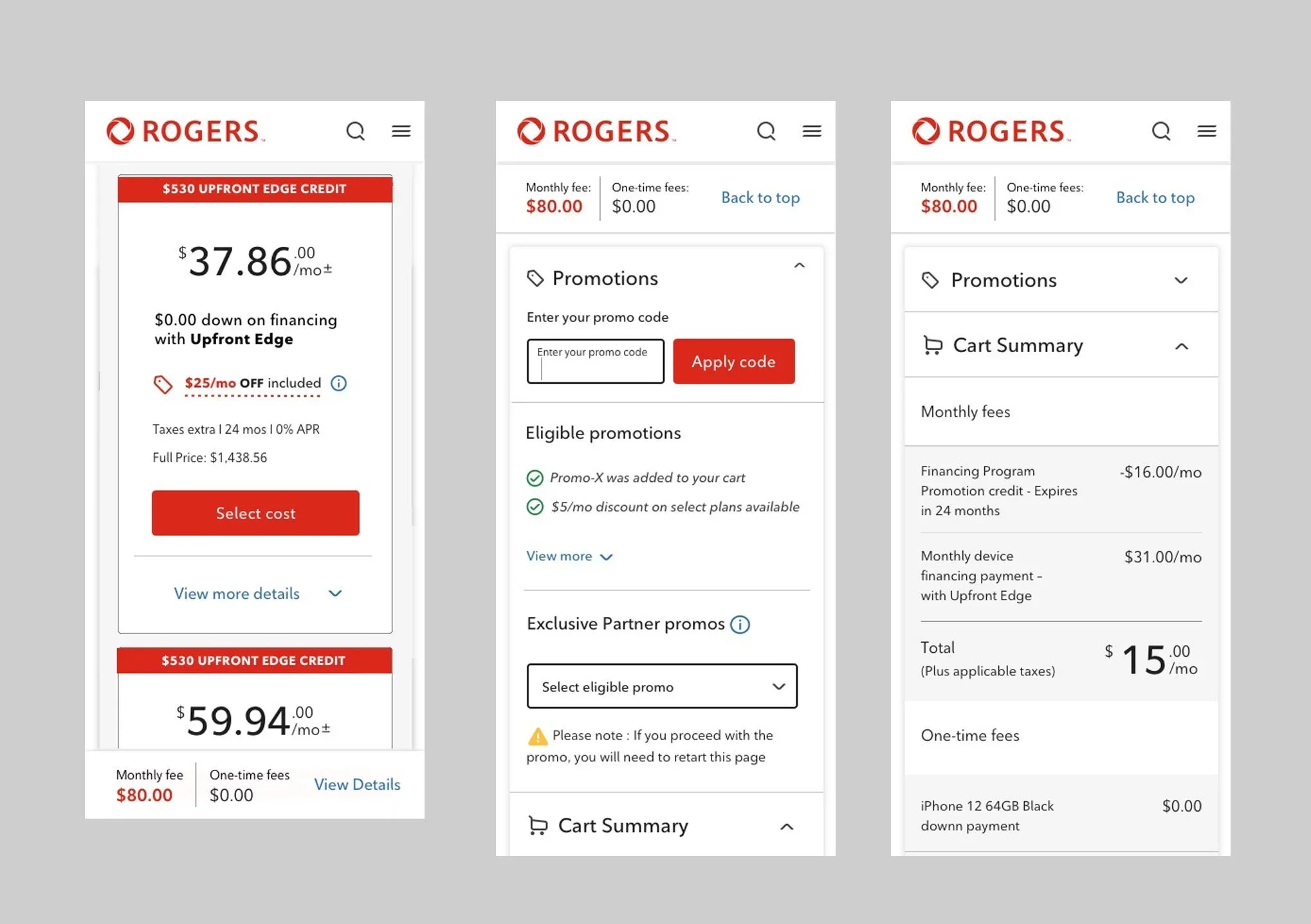
The final design required coordination across multiple teams, including Promotional Offers and Checkout, to enable dynamic aggregation of discounts within the persistent cart.
Promotions are automatically reflected in the total monthly cost, eliminating the need for users to mentally calculate discount impact. This restored pricing transparency while preserving early promotional visibility required by business constraints.
Users can now:
• See the total monthly fee update in real time as promotions are applied
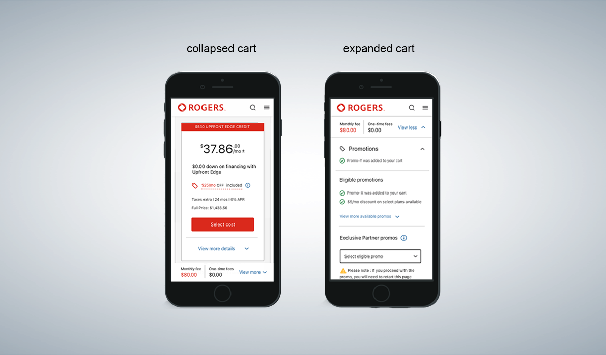
• Access a clear breakdown of discounts at any point via the persistent cart
• Continue exploring plans while keeping the checkout action visible
VIEW PROTOTYPE HERE (scroll and click): https://www.figma.com/proto/XVPGlSeyiJRslvPR6fRhgt/Portfolio?node-id=44-321&t=rDowtvevDJurS8Q0-1
CONSTRAINTS / TRADE-OFFS
While conventional ecommerce patterns position promo code input at checkout, business requirements mandated promotional visibility during plan selection.
By integrating dynamic discount aggregation within the persistent cart, I preserved campaign requirements while restoring pricing clarity.
BUSINESS IMPACT
• Improved pricing transparency perception
• Reduced cognitive friction on mobile
• Established a scalable framework for future promotional campaigns
• Created a reusable pricing reinforcement model within the buy flow
• 37% increase in mobile checkout completion, indicating users felt more confident in their purchase decisions (based on post-launch analytics).
• The persistent cart was adopted as a global Design System component, for both Rogers and Fido (2nd largest brand).
