

Rogers • Product + Design Systems
Summary: Improved a core component across Rogers and Fido to align UX, cut design debt, and ease dev handoff.
Problem Statement
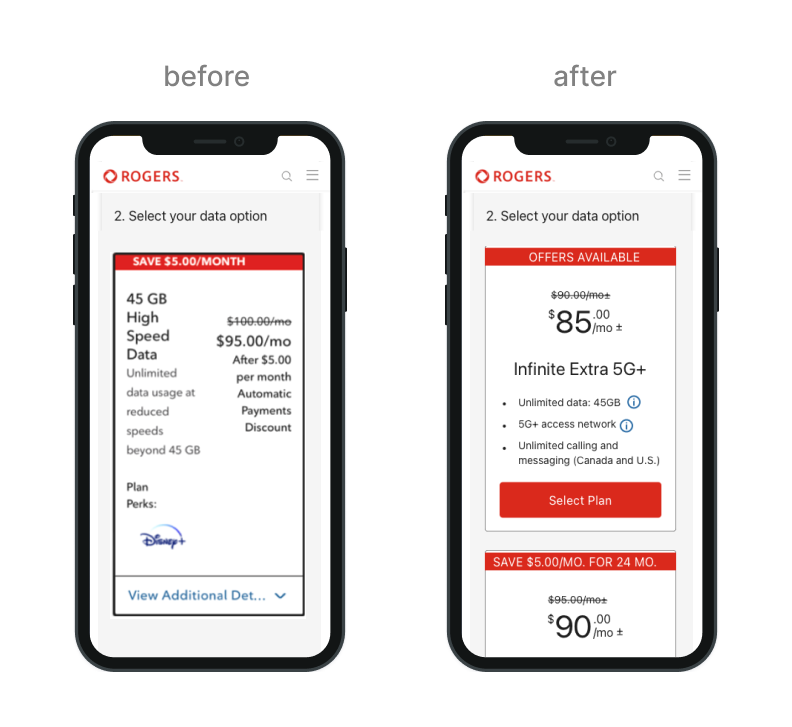
Analytics showed an 85% drop-off on mobile during plan selection. The existing plan tile’s cluttered, without clear pricing, and poor visual hierarchy, making it hard for users to understand what they had to pay for or compare options quickly. This cognitive overload discouraged mobile users from continuing, reducing adoption and hurting conversion.
Methodologies
Data & Research Review: Synthesized prior usability studies calling out “price confusion,” “too much copy,” and “unclear tap targets.”
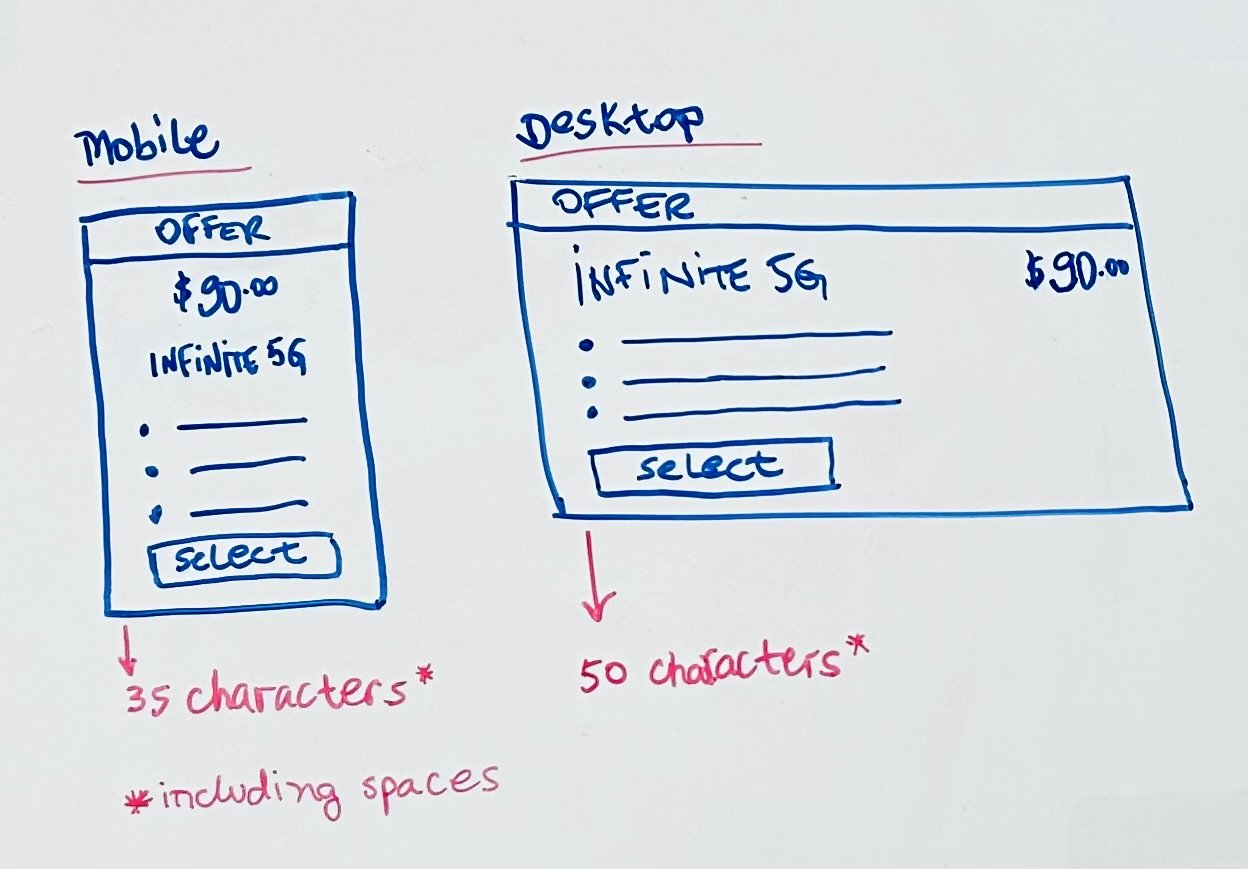
Content Strategy Alignment: Workshop with Content Design to set a strict character limit per feature (every line had to pull its weight).
Mobile-First Iteration: Reflowed layout to a single-column card, bigger tap area on the “Select Plan” button, and more white space around bullets. Leveraged our DS’s responsive grid settings to maintain breakpoint parity between mobile/desktop.
Cross-functional Collaboration
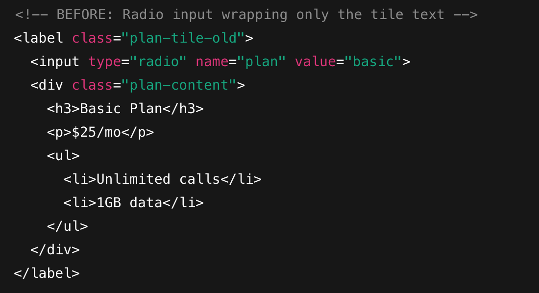
Legacy “Radio Button” Container: Refactored radio-button wrapper code to allow icons & buttons inside of the tile.
Legal Copy constraints: Moved legal copy into hover tooltips to reduce clutter.
Accessibility Validation: Conducted an accessibility audit to ensure the new hierarchy made sense and readability was on point.
Explorations & Thinking
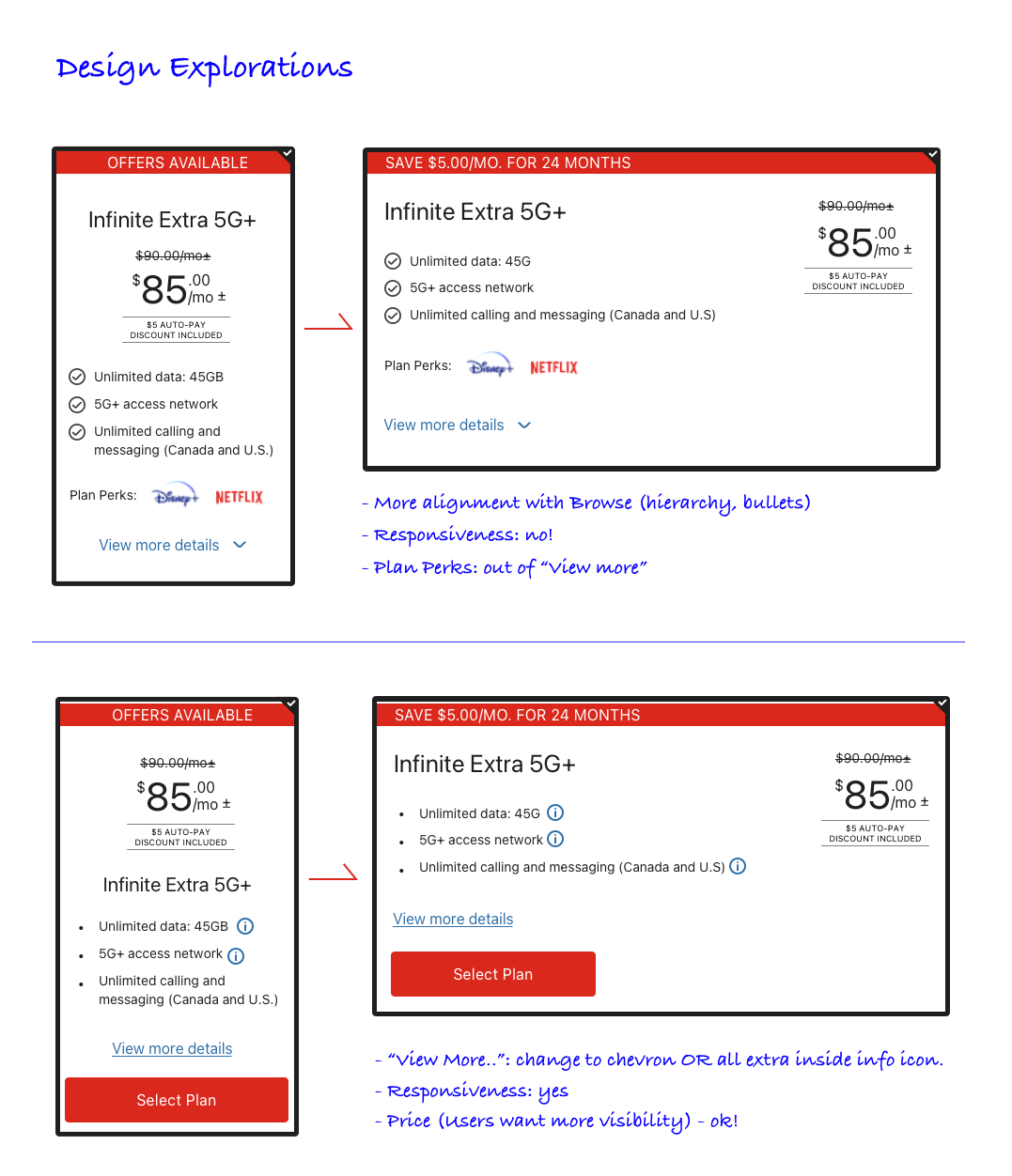
To arrive at the final tile layout, I explored different variations, testing for flexibility, clarity, and consistency across use cases, focusing on:
Visual scannability
Hierarchy testing
Responsiveness
Brand & visual cohesiveness
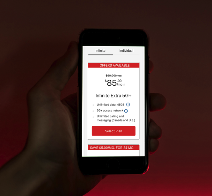
Final Design
The final design emphasizes clarity, hierarchy, and brand consistency.
Pricing: positioned prominently at the top, using bold typography to immediately address price sensitivity and decision-making.
Plan name: clearly defined, followed by concise feature bullets supported by info icons for additional context (e.g. legal copy)
Primary button: the "Select Plan" CTA is placed at the bottom for a strong visual finish, facilitating the plan selection right away.
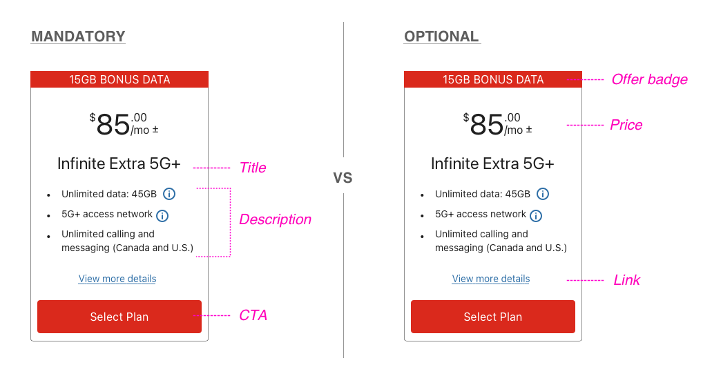
Content Flexibility & Documentation
To ensure any designer across Rogers or Fido could confidently use this tile, I defined the component's structure, usage rules, and flexible variations by creating documentation, like the examples below:
Mandatory elements: Title, description, primary CTA
Optional / Booleans: Top offer badge, price, legal copy, secondary CTA, additional discounts (e.g. auto-pay).
Variants: CTAS - Rogers (red CTAs) or Fido (yellow/black CTAs)
Brand guidelines: mostly brand colours + hex codes and typography
Impact & Scale
90% of participants in post-launch usability tests reported that the new tile was “much clearer” and “easier to select” than the old design.
32% mobile plan sales increase within two weeks after the project launch.
The final tile component became part of the shared library across Rogers and Fido, used by multiple teams in both desktop and mobile flows.